4.25.2011

scrumptious carrot cake


I baked a super scrumptious carrot cake from scratch for Easter. Baking isn't my forte so, I'm super excited when a make a dessert that turns out this good. I found this carrot cake recipe on allrecipes.com, my "go to" place for recipe hunting. I changed a few things based on comments on the original and here is my version:

Cake Ingredients

  • 4 eggs
  • 3/4 cups vegetable oil
  • 1/2 cup of applesauce
  • 1 cups white sugar
  • 1 cup brown sugar
  • 2 teaspoons vanilla extract
  • 2 cups all-purpose flour
  • 2 teaspoons baking soda
  • 2 teaspoons baking powder
  • 1/2 teaspoon salt
  • 2 teaspoons ground cinnamon
  • 3 cups grated carrots
  • 1 cup chopped pecans

Frosting Ingredients

  • 1/2 cup butter, softened
  • 8 ounces cream cheese, softened
  • 3 1/2 cups confectioners' sugar (could even be reduced to 3 cups IMO)
  • 1 teaspoon vanilla extract

Directions

  1. Preheat oven to 350 degrees F. Grease and flour or line with parchment paper (2) 9 inch round pans.
  2. In a large bowl, beat together eggs, oil, applesauce, white and brown sugars and 2 teaspoons vanilla. Mix in flour, baking soda, baking powder, salt and cinnamon. Stir in carrots. Fold in pecans. Pour into prepared pans.
  3. Bake in the preheated oven for 35 minutes, or until a toothpick inserted into the center of the cake comes out clean. Let cool in pan for 10 minutes, then turn out onto a wire rack and cool completely.
  4. To make frosting: In a medium bowl, combine butter, cream cheese, confectioners' sugar and 1 teaspoon vanilla. Beat until the mixture is smooth and creamy. Frost the first layer, then add the second layer and frost.
This cake turned out super moist and just the best carrot cake ever!  Of course, I am a little bias since I'm extremely happy it turned out okay but, really it was so good. Enjoy!

4.08.2011

art masterpiece: whistler

At the Piano by James Whistler 1858-59

I have found that 1st graders are obsessed with death.  I think they are trying to make sense of it.  Each week I go in someone always asks if the artist is alive and if I say no (which I usually do) they want to know when, how old and how.  This picture was interesting because it touches on the subject of death and keeping someone alive in memory. 

About the Artist
James Whistler was born in Massachusetts and moved to Russia with his family when he was 9 years old. When James was 15 his father died and his family moved back to the United States. At 17, he worked for the government making maps. At 21 he went to Paris to become a painter and at 25 went to England where we stayed.  He never returned to the United States. He died at 1903 at the age of 69.

What do you see in the painting? Do you think he knew the people in the painting? Who are they? How old is the little girl? This is the artist’s half sister Deborah and her daughter Annie, 10 years old. The painting is showing his half sister playing the piano as her father once played for her.

Why do you think they are dressed this way? Deborah is mourning the death of her father 10 years earlier. Black is the color for adults to wear when mourning the death of someone.  White is the color for Victorian children to where while mourning.

This painting was created in 1859, 152 years ago. The name of this painting is At the Piano and is one of the artist’s first paintings. Deborah is playing the same piano that she used to play with her father.

What does this painting sound like? Both mother and child have a look of seriousness and concentration creating a mood of quiet music and memory.

How do you think the artist felt when he painted this picture? Why do you think he painted it? This is how he wished to keep his father’s memory alive.  This was painted 10 years after his father’s death. This is a mirror of his father and sister playing at the piano, now his sister and her daughter are at the piano. I don't know if Whistler's sister really played piano with her daughter like her father did, but I hope so. It is a nice thought that she cherished those special moments with her father and therefore had them with her daughter.

If you wanted to paint a favorite memory of your father or mother what would it be? The kids really love this kind of question. It allows them to talk about their life and I think it helps them relate to the artist on a more personal level.   

For me, a memory I would like to paint would be a picture of my parents laughing and dancing.  They always knew how to have fun (and still do)!

How about you, what memory would you want to paint?

4.05.2011

new favorite item I didn't know I needed


I purchased these beautiful dishcloths from The Dishcloth Shoppe.  The Dishcloth Shoppe offers handmade, eco-friendly, functional and absolutely gorgeous dishcloths, made from 100% cotton. At first, I was uneasy washing my messy pots and pans with these oh so pretty cloths.  But once I did I found they are surprisingly durable and abrasive.

I remember my mom using dishcloths way back when but, sponges ultimately took over our cleaning habits.  In our home, we have embraced cloth napkins instead of paper napkins, cleaning towels instead of paper towels and real plates and utensils instead of disposable but, sponges are still here.  I'm not sure why I held onto them for so long, they are expensive, they aren't pretty sitting on my sink (like these beauties) and then they get tossed to the landfill.  I'm happy that another area of our home "greened".

We wash our kitchen napkins and cleaning towels on a daily basis so these will be a small addition to the wash. There are some good suggestions on how to keep dish cloths smelling better on yahoo! answers.
I hope they last a long time. 

Do you used dishcloths? Any tips to help them stay fresh and long lasting?

4.01.2011

april biz goals


I moved forward in many creative ways in March.  I strayed from my goals and allowed my journey to take some twists and turns.  Before jumping into April let's see what happened in March ...

March Goals
  • credible nutrition postcard design - done!
  • east valley artisans postcard - only received 1 artist image so, I need to follow up on participation.
  • move creative stash website to my blog - eek, I'm ignoring this
  • begin new wedding invitation design - I will be tackling this asap
  • custom painting - need to purchase the canvas and get started
  • custom coaster - artwork prints have been chosen, I need to print, cut and resin.
  • get involved with this month's creative every day theme - this was lost in the shuffle.  I will try again for April.
  • family art play time- yes of course!  lots of family painting sessions this month
  • try meal planning- downloaded a planner but haven't set time aside yet to think on this.
  • gym - pretty good.  Not great but, pretty good. We took some family walks this month which were nice, would like to keep up with those.
Although my goals still need attention, I did get down to business in the following ways ...


 I have designed a few software icon packages in the past and received a referral this month to create this software icon package for Design Tech. 


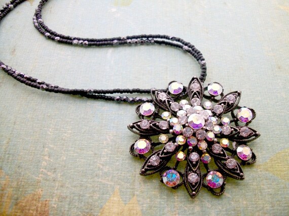
I received a custom order for an art print necklace and since I was mixing resin for that, I made a bunch of art pendants to create new necklaces with. 


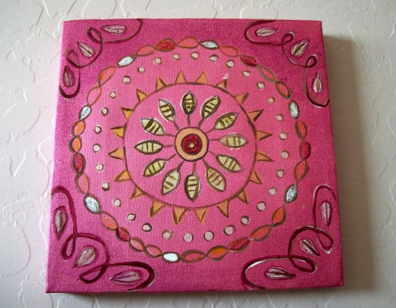
 I have been wanting to experiment with a mandala style paintings and one evening I was inspired to do it.  This painting is for sale in my Etsy shop along with these new items.  


A few months ago I created the logo design for Credible Nutrition and this month they contacted me about designing a postcard to go along with it.  Barbie and Rachel are a joy to work with.  They offer a wide range of counseling and consultation options to help get you healthy! 

Lastly, a childhood friend is expecting her first baby and had a baby shower back in NY.  Sadly, I wasn't able to attend but, I channeled my energy and love for her into a gift for the baby's nursery. I really want to show you it but, I just mailed it off yesterday so, I'll have to wait until she receives it next week to blog about it.

So you see, I was quite busy even if my goals were a bit abandoned.  I hope my momentum stays and I can will my wondering self into doing what I plan this month!

April Goals
  • begin S&J wedding invitation design
  • completed commissioned baby nursery painting
  • print art and resin custom coasters
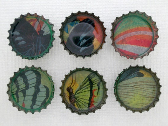
  • list new bottle cap magnet set and create with resin art pendants
  • add about page to creative stash blog
  • get involved with creative every day theme - small
  • family art play time
  • setup monthly meal plan
  • movement - family walks, yoga and dance
The only way of finding the limits of the possible is by going beyond them into the impossible. ~ Arthur C. Clarke
    If you would like to join in the Meetup biz goals fun, head on over to Athena Dreams to read more about how we support one another and how to join in.

    3.31.2011

    new items in my shop

    With a new month upon us, I wanted to share a few new items that have been added in my shop recently.


    I'm so happy and truly blessed to be able to create on a regular basis and love sharing my joy with you! Hope you enjoy them.

    3.29.2011

    asymmetrical necklace


    After yesterday's post about the 4 renditions of this asymmetrical necklace (which you can see here) a friend suggested I remove the pendant all together.  I did think of that while designing but, was stuck on the idea of using a pendant.  After her suggestion I decided to see if I liked it without one and you know what, I did.


    The final design without the pendant is a modern version of yesterday's design.  I also think that removing the pendant that the focal becomes the colors and composition which in fact was just want I wanted to begin with.  This is exactly why I LOVE feedback, thanks Heather!

    3.28.2011

    work in progress:
    asymmetrical necklace

    I love asymmetrical designs and like to explore them from time to time however, when it comes to beading I tend to create with symmetry.  My confidence level isn't as high with beading as it is in other mediums so, I think that is why I have stayed in the comfort of symmetry.  Symmetry makes sense and is much easier.  Asymmetry is hard. Although it looks effortless, it actually takes a lot more time and thought.

    This weekend I started a beaded necklace design with asymmetry in mind. Here is my work in progress:


    This was my starting point.  I wanted to even out where the brown beads ended on each side and then finish the design with turquoise.  The 3 brown beads on the right side were bugging me and once I snapped this photo I knew why.  It wasn't asymmetrical enough.  It was almost there, I needed to push a little further.


    This second design felt much better for the asymmetrical look I was going for. I really liked it but, again after taking the photo I knew the star pendant wasn't right. The beads and the design were too strong for that pendant, it was getting lost.  I needed something bolder.


    Now this pendant, I was sure, would be it!  It's a gorgeous ceramic pendant and the colors blend really well with the turquoise beads however, once again when I snapped the picture it didn't feel right.  It was unbalanced.  The turquoise color took a larger stage in the overall design because of this pendant and made that side of the necklace seem heavier then the other side.


    Finally, I tried this brass tree pendant.   The natural brass pendant doesn't compete with the brown or turquoise beads, the circle shape flows nicely with the natural brass rings giving the brass more weight and made the entire design feel balanced even though it is not symmetrical. Whew!  That was challenging. But feels oh so good to stretch out of my comfort zone. I have always admired asymmetrical design because of their complexity and now I created one of my very own!

    Because I wanted to share the process with you on my blog I took all these pictures and they really helped me "see" the design better.  Sometimes just taking a step back and looking at a project differently, like through the lens of a camera, helps you make decisions about the design that you may have overlooked otherwise.

    What do you think?  Do you like my final design or do you think one of my earlier versions is better then the last one?  Have you tried something outside of your comfort zone recently?  If so, I'd love to hear about it!

    3.25.2011

    art masterpiece: monet

     
     Chrysanthemums by Claude Monet


    The discussion on Claude Monet was great. How could it not be, right?  Monet's work is wonderful; impressionism artwork many of which were made outside with lots of color and light. I brought lots of small examples of his work to show the class in addition to this painting.  I found it especially interesting that he panted the same scenes over and over again with different results due to the time of day and season. I didn't realize he did this.  Showing examples of the Poplar Series artwork (shown left) helped the kids visualize how the same picture can be painted and look so different. 

    About the Artist
    Claude Monet was born in France in 1840. He knew from a young age that he wanted to be an artist rather than go into the family grocery business, and so he went to school to learn art. Monet felt that nature knows no black or white this resulted in this artist creating colorful pieces of work. This is his painting that we will be looking at today.

    The name of this painting is Chrysanthemums.  What do you think a Chrysanthemum is?

    What does it look like close-up?  Show Monet's painting and emphasize it looks fuzzy up close but realistic from a distance.

    This painting style is called Impressionism.  Monet created the style as he experimented with light and color and learned to portray subjects with quick brush strokes. When you stepped back from the canvas, your eyes would blend the colors together.

    What is impressionism all about?  Light, color and capturing a moment in time.

    Monet liked to paint “en plien air”.  Anyone want to take a guess as to what that means? He enjoyed painting outdoors observing how the light would change as the day progressed. Monet painted outdoor scenes as he saw them.

    Monet planted a grand garden with a pond and Japanese bridge. He loved to paint the garden and the lily ponds. Monet was fascinated by light; the way it reflected off objects and water. He featured his garden in more than 200 of his paintings.

    Monet painted his garden scenes over and over again, and each would be different, how could that be?  He painted at a different time of day when the sun was at a different position in the sky.  In the morning when the sun is rising there is dew on the plants that make them glisten, then again in the afternoon when the sun was the brightest and again in the evening when shadows are made and the sun sets a warm glow.

    Why would that change the picture?  Light affects color and shadows.  Also different season created different colors. (show poplars) Do you know what warm colors are? (yellow, orange and red).  What about cool colors? (blue, green and violet).

    Monet used texture in many of his painting. Texture is the quality of the surface, smooth or rough. Texture you can touch or feel. Monet created texture with thick paint, brush strokes and dabs of color. Do you think the texture of this painting rough or smooth?

    3.11.2011

    art masterpiece: russell

    Sun River War Party by Charles Russell

    Sun River War Party by Charles Russell

    About the Artist
    Charles Marion Russell was born March 19, 1864 in Missouri. When he was a boy he was fascinated with Cowboys and Indians. He read whatever he could about them and was determined to become a real cowboy. Growing up he had a horse named Jip and got in trouble from his mother for drawing pictures of cowboys and horses on his walls. He is a self-taught artist.  Maybe that is why he painted things just as he saw them, REALISTIC. Charles Russell is famous for his detail, his storytelling and showing things in action.

    What is happening in this painting? Indians are going to war

    Who is in charge? We discussed what the Indian's are wearing to determine who was the chief and in charge.

    What story is he trying to tell? This picture is a painting of Indians from a true cowboy’s perspective. This is how he saw them. Charles Russell told stories of actual events and people. Many stories of the West that he used in his work were legends he heard himself as a cowboy. Often his paintings leave you thinking “What will happen next?”

    Here are some open ended questions I asked to spark discussions:
    • Can you imagine being inside this picture? 
    • Where is the light coming from? Do you see shadows?
    • What time of day is it?  How can you tell?
    • How does this painting make you feel? Sad, quiet, scared, why?
    • What kind of colors did he use? Warm or cool, do you know the difference?
    Charles Russell is one the most famous western artists.  He was a real cowboy and is known as the "Cowboy Artist". He completed 4,000 works of art during his life.  I hope you liked Charles Russell’s work; realistic artwork made by a real cowboy.

    Thank you for reading along with me today.